If you are painting your home, or hiring a professional to do the job for you, there are ways in which you can get a highly original result. One of the ways you can achieve this is by opting for complementary colors. If you do this in the right way it can be a very effective way of ensuring a stand out paint job.
If you want help from the experts then they can give you assistance with your color choice; you can learn more here. It may seem strange that complementary colors such as blue and orange and green and red can work well together but if you are a little daring you can actually create a color scheme that really pops.
Why do complementary colors work?
You would think that complementary colors would be jarring but if they are used well this is not the case. The fact is that when you look at one color your eyes become a little overwhelmed by it and your brain automatically seeks out something to complement that color so that it can take a break. This means that you automatically feel good as a result of using commentary colors together.
How to use complementary colors well
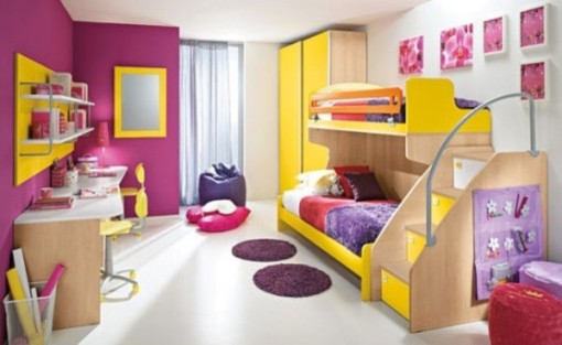
It’s important to remember that you have to use complementary colors in the right way in order for the effect to work well. If you use the colors in the same amount and at the same level of intensity the result can be really intense and overpowering.
The best way to use complementary colors is to use one in a large amount but at a low intensity and the other in accents around the room and at a high intensity. This way the colors balance with each other and the result is easy on the eye.
How complementary colors overcome the match pitfall
If you have a color that you want to be the main focus of your home design it can very tempting to have decoration where everything, matches to that color. This creates a very bland and uninspired effect. Using complementary colors helps to accentuate your favored color while also providing a contrast that catches the eye.
You should always approach the use of complementary colors with caution though; you do not want the result to look like a sports logo or a child’s bedroom. Complementary colors need to be used in a thoughtful and tasteful way so that they are appealing to the eye. The idea is to add a little drama and originality to the decor of your home, not to create an effect that is hard to look at.
If you love the color green, for instance, you do not want to just paint the entire room in different shades of green. This is not pleasing to the eye as it will be searching for something to offer contrast. Add some vivid red accents to a muted green wall and you can end up with an effect that is really special. That is how you use complementary colors correctly.